.avif)


DAPPA is a styling app that uses advanced AI technology that places clothing directly onto your photos, letting you visualise how outfits look before you buy. DAPPA had already provided us with design tasks to complete and our design team needed to not only fulfil these tasks, but also construct a consistent and intuitive aesthetic for their app.
My role in this project involved designing aesthetic mobile interfaces and working in a team create designs that best aligned with DAPPA’s goals.
Role
UX/UI Designer
Collaborators
Edwin Sit
Lily Duong
Aryan Rustagi
Kelly Wu
Lily Duong
Aryan Rustagi
Kelly Wu
Tools
Figma
Duration
2 months
THE PROBLEM
Since DAPPA was in its early startup phase, the interface designs were underdeveloped and required further design, development, and testing.

Discover
How can we better understand the project?
Competitor analysis
To start, we reviewed other fashion and styling apps and studied their interfaces – what are the best practices and unique selling points that we could take inspiration from. Collectively, we created a mood board that we would continually reference throughout our design process
user interviews
We conducted informal interviews with target users to explore the expectations for a virtual styling experience. What people have said:

No idea if clothes will look good on me or whether it will fit me”
No idea if it’ll go well with my current wardrobe”
Stakeholder interviews
We also spent a lot of time speaking with our clients and understanding their design vision and product goals. What they said:
We wanted to re-iterate on our wardrobe functionality design and our virtual try-on functionality”
Improve the interface and give us suggestions on how to make it look better”

Define
What do our findings from the “discover” phase mean?
Design Challenges
Through our research, we identified these overarching design goals. As DAPPA has already established some foundational concepts and designs, as a team we needed to clearly identify our objectives for ourselves and the clients.

Redesign Suggestions
Redesign suggestions of the user interface as it lacked an intuitive design which made it difficult for users to navigate.

New Design
The app also needed an engaging way to showcase their main features – AI powered virtual try on.

Content Revision
As new users, how did our design team perceive the app initially, are there any confusing points and how could this be improved?
Persona
To better understand the overall user experience and ensure our proposed solution aligns with user needs, we created a persona.

Tina
19
Unsure Shopper
Tina is a little shy when it comes to shopping and doesn't like using the change rooms at retail stores. She wished that she could level up her fashion game by knowing what would go well with her existing clothing.
Motivations

Wants to shop for more clothes
Wants to try different clothing
Frustrations

Doesn't like change rooms
Doesn't know what will go well with her clothes
Design success criteria
To understand our tasks, we created user stories for each design task to create benchmarks for evaluating the success of the design we had created.
For example:
For example:
.png)

Develop
Creating the designs and exploring solutions.
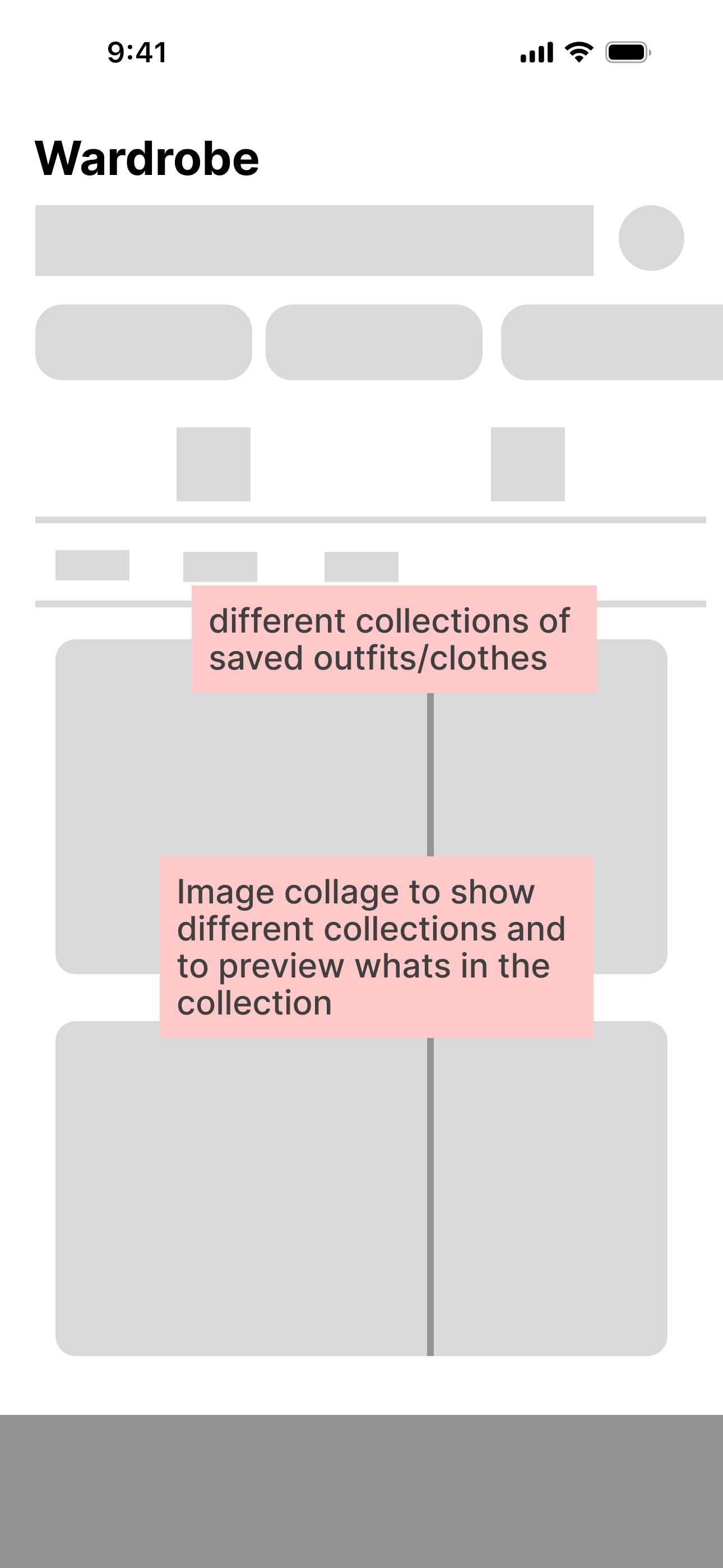
Wireframes
First, we collectively worked on wireframes that we thought best optimised navigation and made sense to us.
Home

Outfit Page

Explore Page

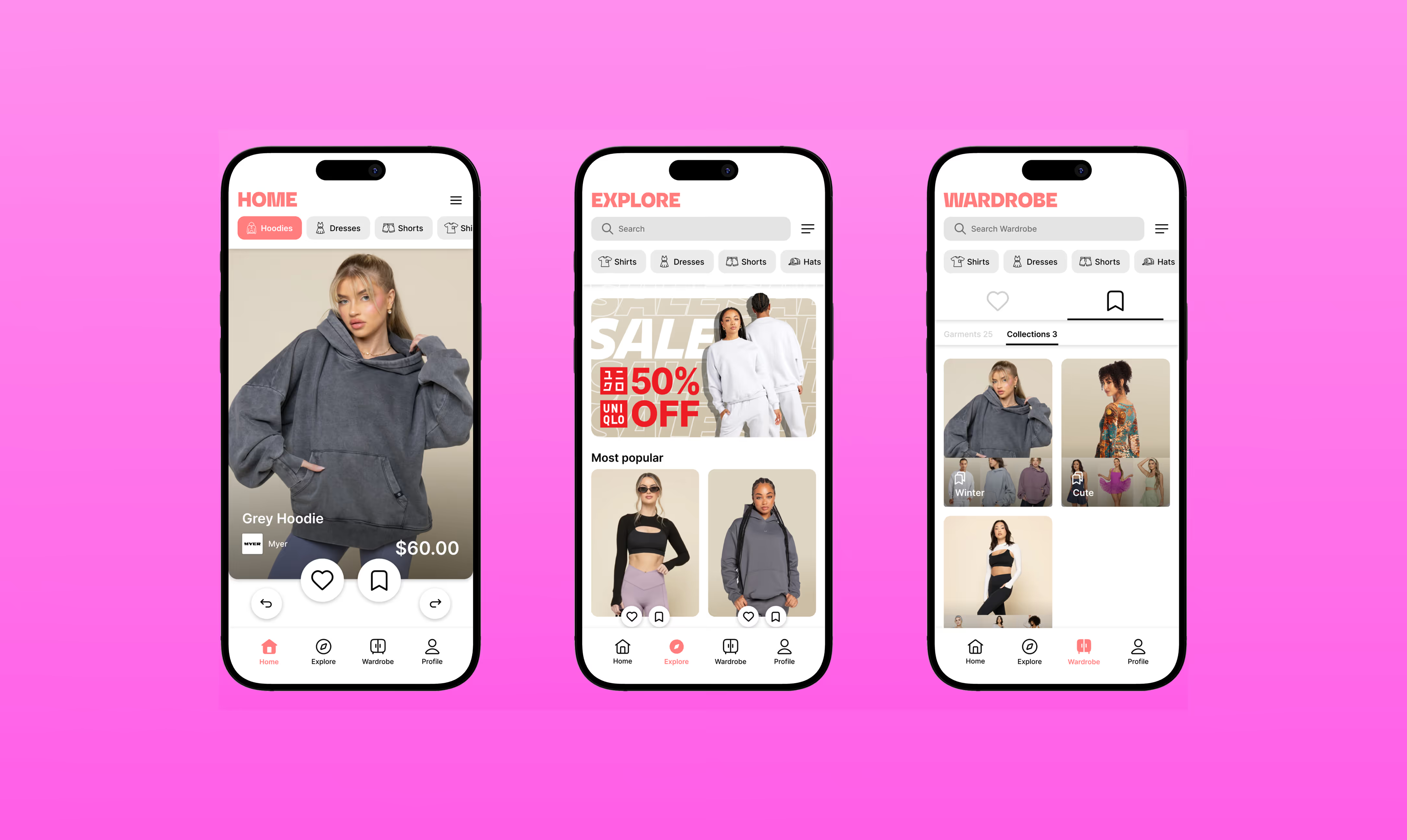
Wardrobe Page (Liked)

Wardrobe Page (Saved)


Design System
Before creating the high-fidelity mockups, we first needed to refine our design system. While an existing system was provided, we wanted to ensure it aligned with our slightly adjusted direction.


Deliver
Finalising and refining the solution.
My Designs
Each of us designed independently while adhering to our established design system. This system allowed us to explore a wider range of interface variations, giving us more options to evaluate and refine in the later stages.
**Final mockups and designs were restricted by the client's confidentiality policy, which prohibits showcasing their work publicly.
**Final mockups and designs were restricted by the client's confidentiality policy, which prohibits showcasing their work publicly.
Home

Outfit Page

Explore Page

Wardrobe Page (Liked)

Wardrobe Page (Saved)

Prototyping
Here is some of the prototyping interactions that I created to enhance the user experience.
Buttons:
Nested Components

Swiping
Figma Prototypes
challenges & takeaways
The challenges I faced in this project:

Balancing design ideas
I faced challenges balancing my design ideas with the opinions of other team members. This required open communication and compromise to find solutions that met the client’s needs.

Team tensions
There were also moments of team tension, which taught me how to navigate interpersonal differences and work collaboratively.

Confusing information
I had to deal with confusing information that was presented to me by the clients, which pushed me to ask questions and break down complex ideas into simple, actionable steps. This experience working with DAPPA helped me improve my problem-solving and teamwork skills.

Design pivot
Midway through the project, the client introduced a shift in direction. I quickly adjusted our designs, and iterated on wireframes, to better accomodate for this sudden change without compromising the usability of the app.